Howdy, Stranger!
It looks like you're new here. If you want to get involved, click one of these buttons!
Quick Links
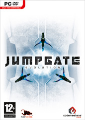
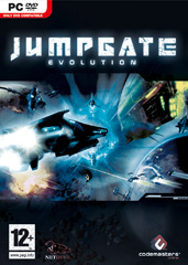
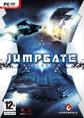
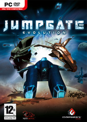
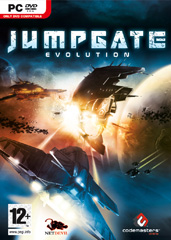
Possible box-art/packaging for JE.
the official MMORPG.com deadhead
It looks like you're new here. If you want to get involved, click one of these buttons!


the official MMORPG.com deadhead
Comments
While I love the simple white cover, it doesn't exactly "sell" the game. This one is the next best thing in my opinion.
But as a note to anyone who sees this, if you haven't already been to the Jumpgate site they have a link up for a survey where you can share your thoughts on the packaging ideas- www.questionpro.com/akira/TakeSurvey
Heya Ides! Been a while, hasn't it?...;)
You interested in JGE too, or just dropping by to evaluate some box art?...
Ohemgee, 'tis Sonicwave! And it's been quite a long while since the days of ArchLord forum/IRCness. =P
At this point I'm just about interested in anything new, hoping something will win my heart over.
Which cover is your personal pick, good sir?
I pretty much agree... Pack 1 looks nice, but doesn't say much about what the game is all about. So I find pack 3 to be the best compromise between overall niceness and telling newcomers what they are about to buy...:)
How about this?
Wow...
Okay I got a laugh out of that. Anyways...
The third box reminds me of that old MS game Allegiance. Which was awesome.
Best ones are the third and last one in my opinion.
the official MMORPG.com deadhead
lolol, definitely should be the cover art
out of the candidates, however, i like the third one that was listed
I like the first one myself. Its simple, but makes you wonder whats behind the cover. Its bold, it would definatly stand out on the shelf now, mostly becuase all the games you see up for sale follow a brown, green, or black styling. So when you look down the aisle a white box will catch your eye much more effectively when its on a back drop of dark boxes.
A reson why i dont like the third box is because its a fair bit of a mix of everything else on all the other boxes. So when a person walks by and pick up the box, they could possibly just think " Oh look, a weird space MMO with an explosion on the front." and may not look inside to see what else is about. Where as, if they come across the Jumpgate game with the box art at the top of the list, they could think " Hmm. WTF is this about?" then open up the cover and learn all the details about it, instead of just what they infer from the cover. --- One thing i do like about the third box art are the little black bubbles that stand alone in the white under the name, it helps bringing the name out in all the white sideing.
In short, you could say i follow this acronym - KISS (Keep It Simple Stupid).
I like the first best, followed by the third. With all the busy covers of games out there my eyes gravitate toward white, solid, or simple covers best and I found myself just scanning over the ones what didn't have any break in the action. The third one at least provides a block of contrast, and is prettier then the first but I definitely think the first would sell more copies.
_________________________________________________
Looking forward to: Stargate Worlds
--SGW Wiki:
http://www.stargateworldswiki.com/wiki/Main_Page
-- SGW Beta Signup
https://register.stargateworlds.com/Registration/
While I love the simple white cover, it doesn't exactly "sell" the game. This one is the next best thing in my opinion.
But as a note to anyone who sees this, if you haven't already been to the Jumpgate site they have a link up for a survey where you can share your thoughts on the packaging ideas- www.questionpro.com/akira/TakeSurvey
That is the box I fevored pretty much in the survey.
And here's the final product, folks:
Posted today on the JGE Facebook page here. Looks pretty cool and action-packed to me, even if it's missing some good old Quantar green.
~ Hobyah Press ~ Wyldlands Celtic & Iron Age RPG ~